The ability to make sound decisions is one of the most important factors that contribute to success in any and all fields and industries. It is essential to have information that can be visualized readily available to you in order to successfully express ideas, regardless of whether you are a high-level or low-level decision maker at your work place. The expansion of a corporation is accompanied by an increase in the amount of data. Depending on the manner in which this information is provided, it may be simple or challenging to sift through all of the facts, results, and patterns that need to be comprehended in order to go to the subsequent logical level.
Data Visualization: What Is It?
Modern data visualization tools offer a high-tech solution for gathering and preparing the data needed to make informed business decisions. It provides a bird’s-eye view of everything that’s happening at simultaneously, allowing executives to detect patterns, statistics, and problem areas. This helps individuals with varying degrees of decision-making ability to collaborate on the best ways to move ideas forward and find the paths with the highest probability of success.
For ages, people have put the idea of visually represented data into action. Data visualization has been utilized to investigate a wide variety of subjects, from the secrets of space to patterns in the world’s financial markets, in a variety of contexts, including scientific laboratories and academic institutions.
How Can Data Visualization Tools Help?
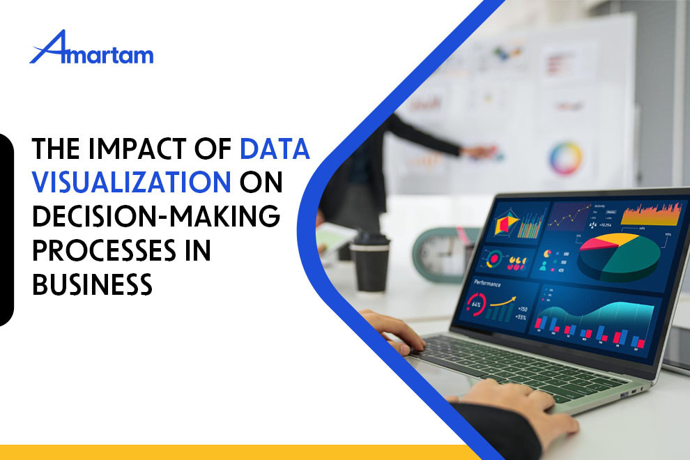
The goal of most data visualization formats is to facilitate the comprehension of large datasets. It is common practice to display numerical data using graphs, percentages, green lights, stop signs, meters, and other symbols that represent the quality of something. The next step is for the decision makers to choose a course of action. A different action will be taken if the indications are discouraging as opposed to an encouraging trend in the data. The most prevalent and easily understood data visualization format by audiences is the basic chart. There are three common ways it is displayed: line charts, bar charts, and pie charts. The fundamental chart’s main goal is to convey important data in a way that’s easy to understand and absorb, so that people can do so with minimal effort and time investment.
If a presentation is being given on how to reach millennials by analyzing their media consumption habits, a pie chart might be used to divide the various forms of media (e.g., computers, cellphones, magazines, and television) into large and little slices according to percentages. This would show it clearly whether corporations prefer traditional ads or social media to reach young people. Status indicators are another common type of data visualization; they employ symbols to indicate certain things within a spreadsheet. Lights and gauges are two examples of the many symbols that might be used to depict status indicators. When users add parameters to status indicators, they can easily tell if the data shows a positive or negative trend, which improves the indicators’ ability to display information.
Using Analytics for Your Business
When data visualization is done correctly, it allows viewers who are responsible for making decisions for big companies to see trends in the data and identify outliers. The most effective visualizations are those that show the interconnections, patterns, and conditions of key parts of a company’s framework, as well as the consequences that each part has on the others. A more complicated and alternative presentation structure may be utilized in the future, depending on the level of expertise of the analysts involved in interpreting the data visualization. Bubble charts, scatter plots, tree maps, and geographical maps are all examples of such formats. Considerations include whether the data being analyzed is best displayed with a more complex chart and whether the target industry is likely to understand the data presented in such forms might determine the suitability of these formats.
On the other hand, analysts who have only seen one set of data visualizations may not have the full picture compared to those who have seen multiple sets of figures and charts on the same subject. The second group may view a figure differently than the first, who may rely on more than one source or circumstance to form their views. This frequently causes friction among decision-makers, which in turn slows down initiatives in specific domains.
Make Better Decisions with Data Visualization!
By presenting the data in a way that is visually appealing, it becomes much simpler to analyze a collection of information, which in turn enables analysts to acquire the maximum amount of knowledge from a research or presentation. It is possible to provide more context to the visualizations by combining them with background information and supplementary information. It can be said that the various types of information are complementary to one another. This combination of information makes it possible to recognize successful formulas in a rapid and easy manner, to zero in on places that have the highest potential, and to single out weak points and cul de sacs. In this way, decision makers who are united by a shared objective are able to combine the information and insights that they have received from all of the information that is now available and then continue to put courses of action into effect.
Data visualization makes all the bad outcomes visible with the good ones, allowing analysts to see a clear contrast from which to draw conclusions and make changes when reviewing a collection of previous activities. Data visualization, when done well, is a communication tool that highlights the positive and negative parts of a collection of facts in an easy-to-understand way, which helps seasoned analysts come to the best conclusions. While data visualization has been around for a while, it is still underappreciated and ignored by certain companies that could really benefit from using it. Companies that master visualization technologies have a significant edge over their competitors. Companies falling into the second group typically have a harder time identifying their strengths and weaknesses and coming up with the right decisions because they lack the necessary insights.
Data Visualization with Power BI: Turning Raw Data into Useful Insights
The Microsoft business analytics application Power BI completely changes the game when it comes to data visualization. It takes raw data and turns it into interactive, dynamic visuals. Power BI’s intuitive design makes it easy to construct visually appealing dashboards, charts, and graphs that simplify otherwise overwhelming datasets. Better understanding and faster decision-making are both made possible by this capability, which also allows for the identification of trends, patterns, and outliers. Organizations seeking to unleash the full potential of their data and produce actionable insights will find Power BI’s drag-and-drop capability and diverse visualization options to be an invaluable tool.
Power BI: Revolutionizing Real-Time Data-Driven Decision-Making
Power BI data visualization provides a full suite of business intelligence capabilities, allowing organizations to make real-time decisions based on data. Power BI makes it easy to connect to a wide variety of data sources, so users can build real-time dashboards and reports that refresh themselves as new data communication. By having access to up-to-the-minute data in real time, decision-makers are better equipped to adapt quickly to evolving business landscapes. In a fast-paced, highly competitive market, companies that use Power BI data visualization to foster a culture of rapid response and data visualization are better able to stay ahead of the competition.
What Role Does Data Visualization Play in the Decision-Making Process for Businesses?
The following conditions must be satisfied for data visualization to be of maximum benefit:
- In order for a presentation to be effective, the data visualizations used must be appropriate and relevant to the data itself.
- For all parties involved, it is essential to combine the data with contextual information that puts the charts, figures, and symbols into context.
- Key data must be presented in a way that suggests good next steps via the visualizations.
Assuming the aforementioned three conditions are satisfied, analysts will be able to confidently go forward with the insights they gain from data visualization and swiftly put them into action.